When Circle K (owned by Alimentation Couche-Tard) acquired Statoil and entered the Nordic and Eastern European markets, they faced a visual challenge: Their existing brand design couldn’t match the strong visual identity of Statoil. This triggered an extensive redesign project, where agencies from around the world were invited to contribute ideas and concepts.


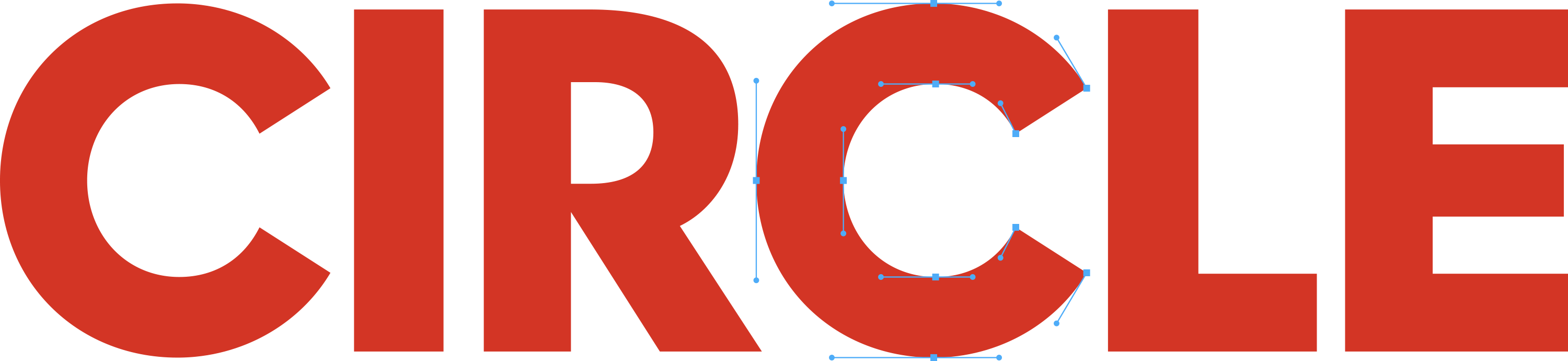

The process took approximately two years and involved countless sketches and competitive rounds. The final design choice was one that combined Circle K’s global identity with Nordic aesthetics – a strong, minimalist, and recognizable brand that stands in contrast to previous versions while meeting local expectations.
The process took approximately two years and involved countless sketches and competitive rounds. The final design choice was one that combined Circle K’s global identity with Nordic aesthetics – a strong, minimalist, and recognizable brand that stands in contrast to previous versions while meeting local expectations.
The process took approximately two years and involved countless sketches and competitive rounds. The final design choice was one that combined Circle K’s global identity with Nordic aesthetics – a strong, minimalist, and recognizable brand that stands in contrast to previous versions while meeting local expectations.
The process took approximately two years and involved countless sketches and competitive rounds. The final design choice was one that combined Circle K’s global identity with Nordic aesthetics – a strong, minimalist, and recognizable brand that stands in contrast to previous versions while meeting local expectations.
The process took approximately two years and involved countless sketches and competitive rounds. The final design choice was one that combined Circle K’s global identity with Nordic aesthetics – a strong, minimalist, and recognizable brand that stands in contrast to previous versions while meeting local expectations.
The process took approximately two years and involved countless sketches and competitive rounds. The final design choice was one that combined Circle K’s global identity with Nordic aesthetics – a strong, minimalist, and recognizable brand that stands in contrast to previous versions while meeting local expectations.
The process took approximately two years and involved countless sketches and competitive rounds. The final design choice was one that combined Circle K’s global identity with Nordic aesthetics – a strong, minimalist, and recognizable brand that stands in contrast to previous versions while meeting local expectations.
The process took approximately two years and involved countless sketches and competitive rounds. The final design choice was one that combined Circle K’s global identity with Nordic aesthetics – a strong, minimalist, and recognizable brand that stands in contrast to previous versions while meeting local expectations.
The process took approximately two years and involved countless sketches and competitive rounds. The final design choice was one that combined Circle K’s global identity with Nordic aesthetics – a strong, minimalist, and recognizable brand that stands in contrast to previous versions while meeting local expectations.
The process took approximately two years and involved countless sketches and competitive rounds. The final design choice was one that combined Circle K’s global identity with Nordic aesthetics – a strong, minimalist, and recognizable brand that stands in contrast to previous versions while meeting local expectations.
The process took approximately two years and involved countless sketches and competitive rounds. The final design choice was one that combined Circle K’s global identity with Nordic aesthetics – a strong, minimalist, and recognizable brand that stands in contrast to previous versions while meeting local expectations.
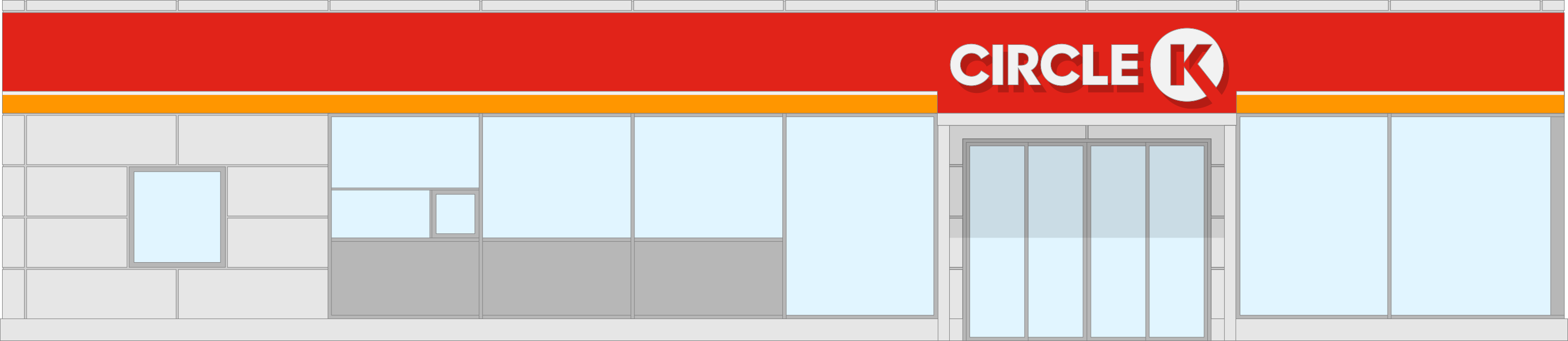
Today, Circle K is one of the world’s largest convenience brands, and its current visual identity is the result of an ambitious redesign.
Today, Circle K is one of the world’s largest convenience brands, and its current visual identity is the result of an ambitious redesign.
Today, Circle K is one of the world’s largest convenience brands, and its current visual identity is the result of an ambitious redesign.
Today, Circle K is one of the world’s largest convenience brands, and its current visual identity is the result of an ambitious redesign.
Today, Circle K is one of the world’s largest convenience brands, and its current visual identity is the result of an ambitious redesign.
Today, Circle K is one of the world’s largest convenience brands, and its current visual identity is the result of an ambitious redesign.
Today, Circle K is one of the world’s largest convenience brands, and its current visual identity is the result of an ambitious redesign.
Today, Circle K is one of the world’s largest convenience brands, and its current visual identity is the result of an ambitious redesign.
Today, Circle K is one of the world’s largest convenience brands, and its current visual identity is the result of an ambitious redesign.
Today, Circle K is one of the world’s largest convenience brands, and its current visual identity is the result of an ambitious redesign.
Today, Circle K is one of the world’s largest convenience brands, and its current visual identity is the result of an ambitious redesign.
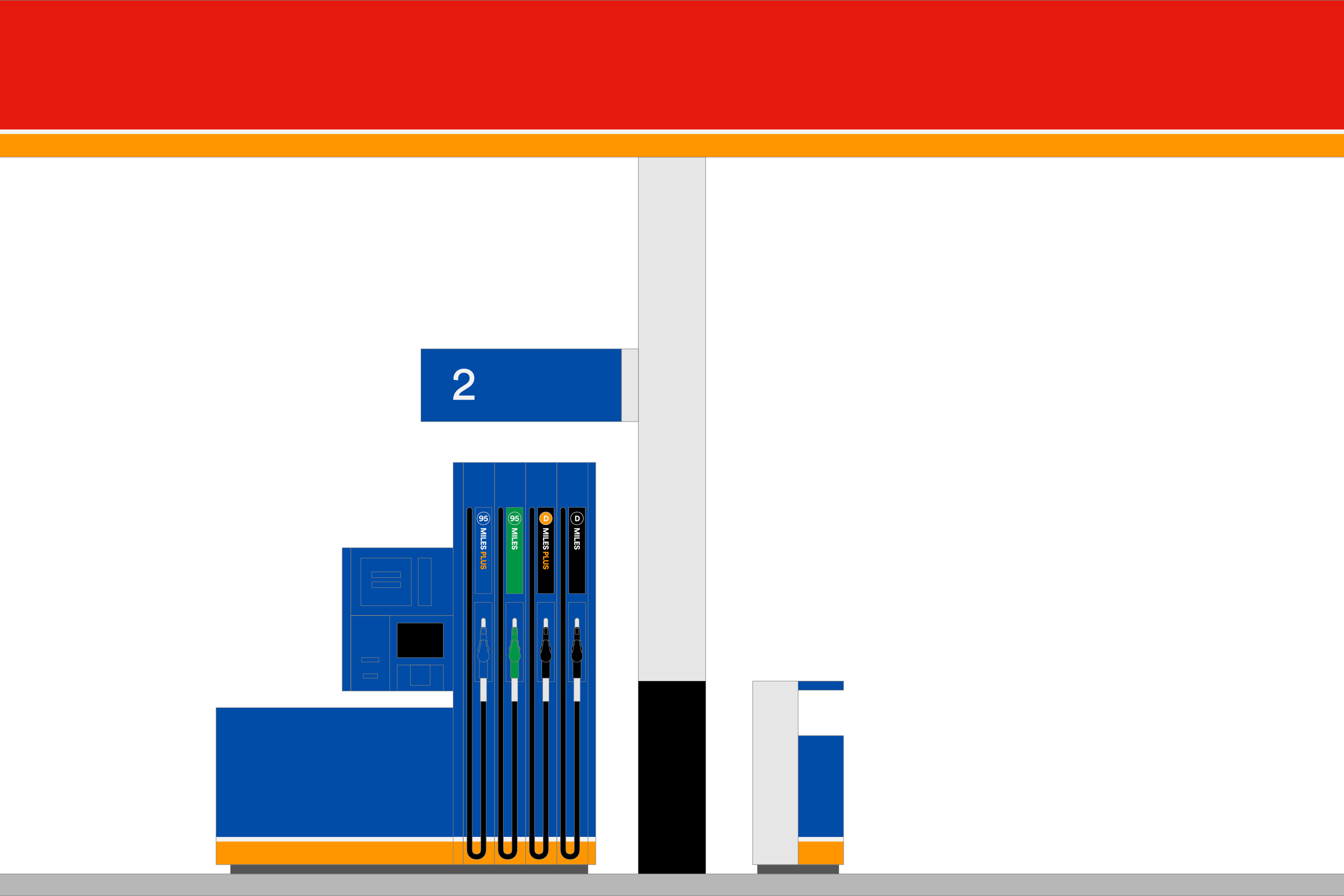
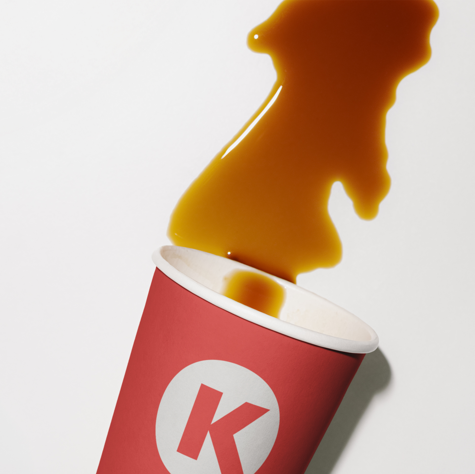
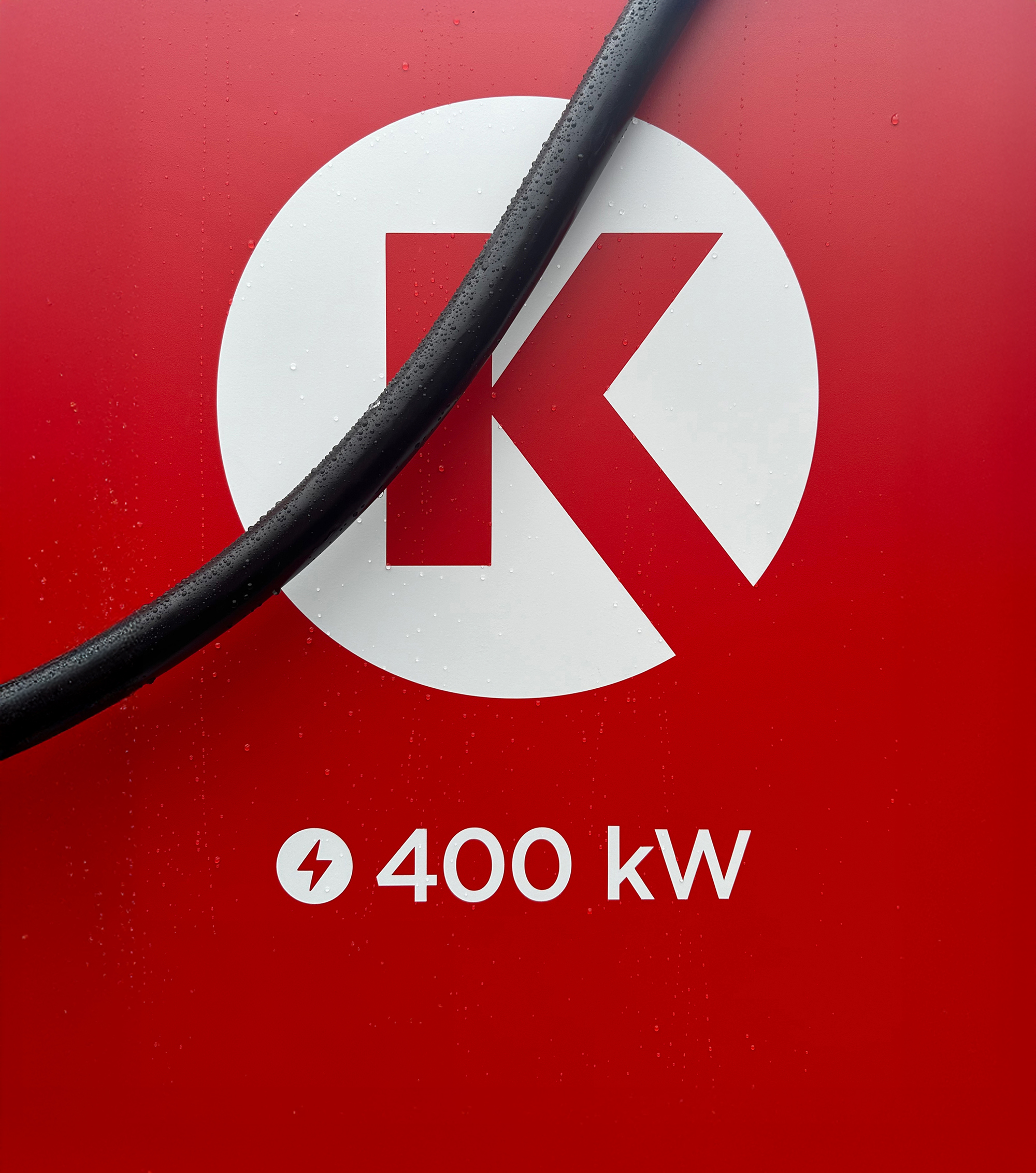
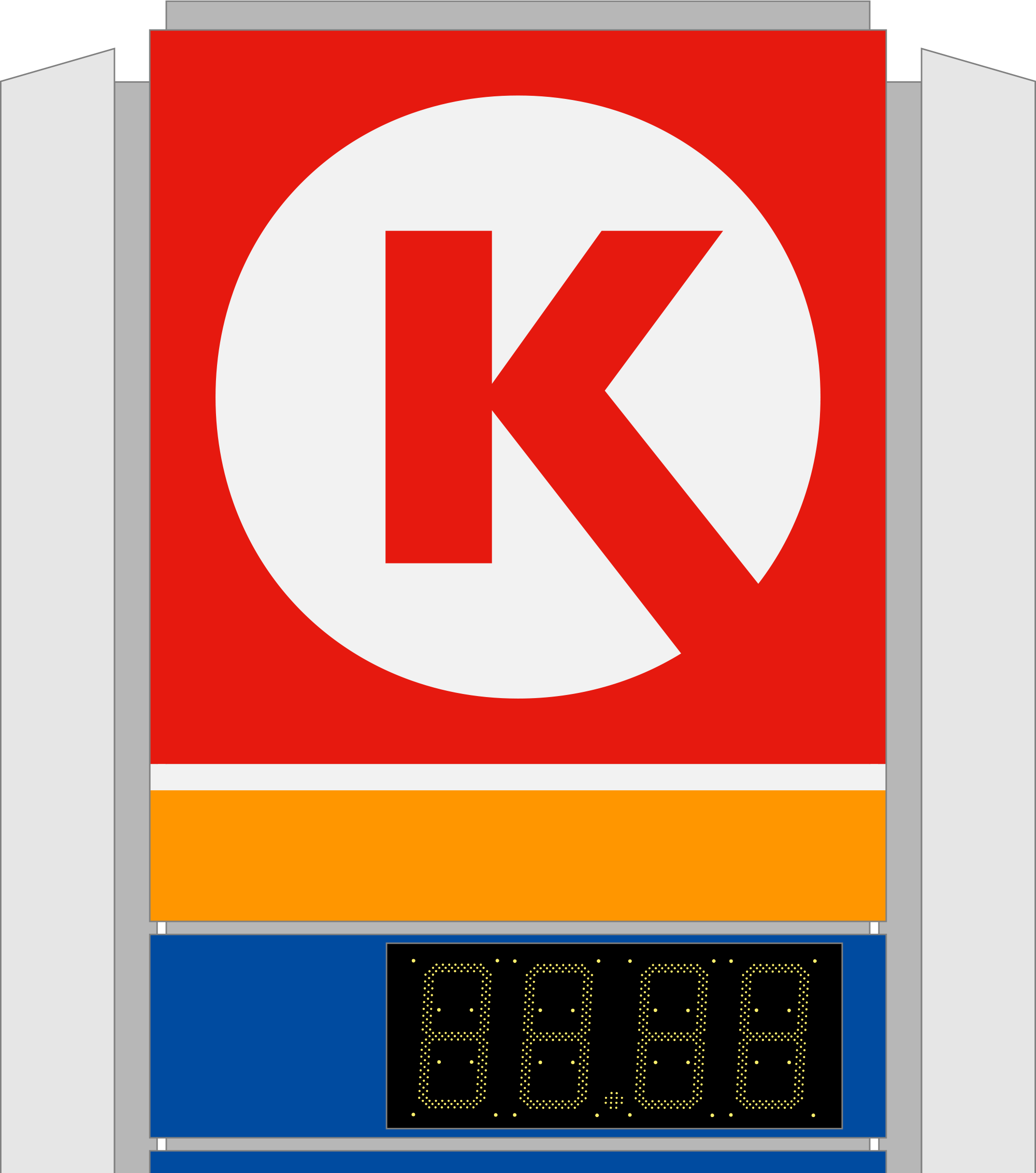
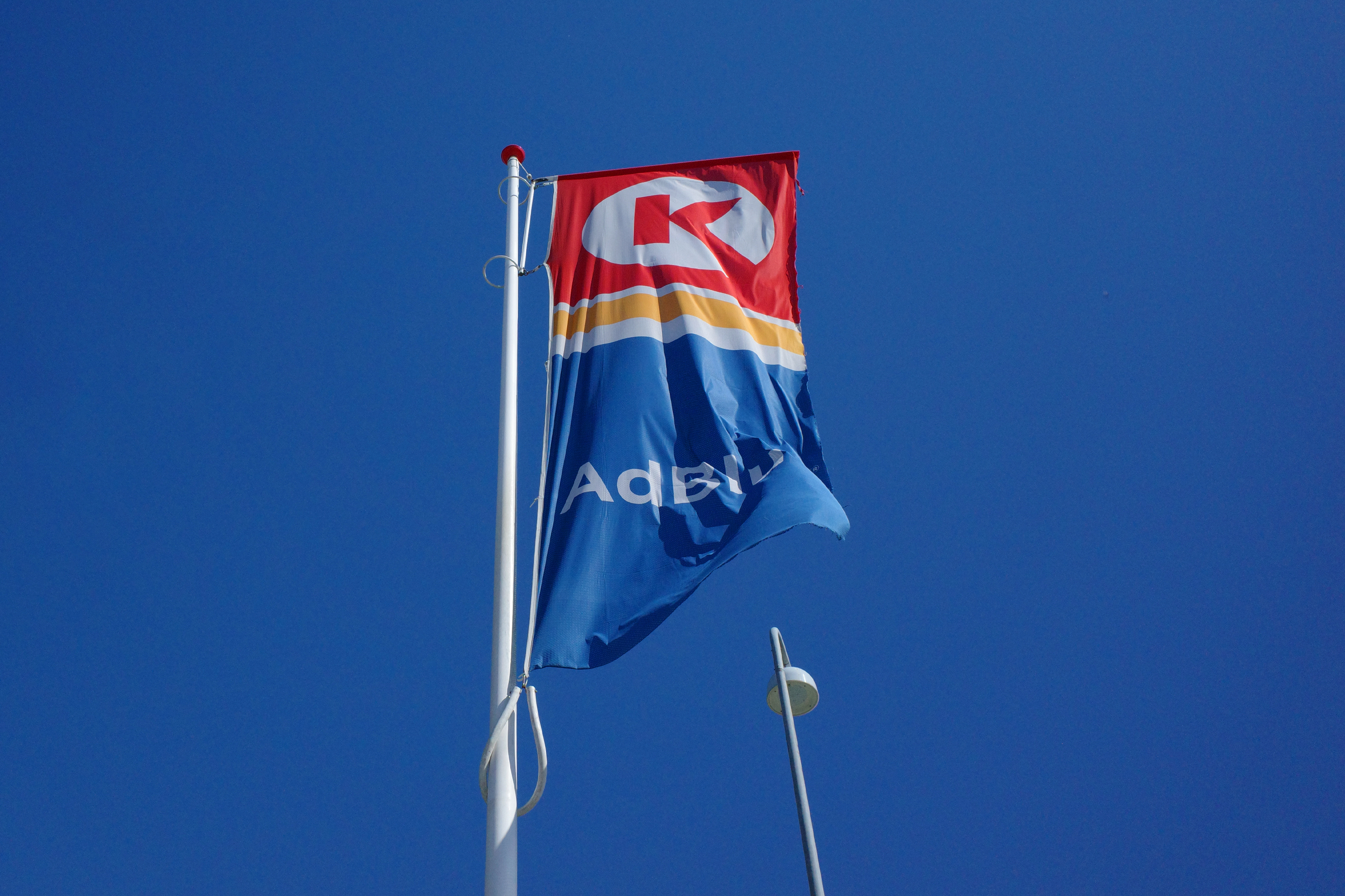
The color scheme helps to communicate Circle K’s focus. Red, the primary color, stands for convenience — coffee, cigarettes, sandwiches, etc. — which makes up the bulk of the chain’s business. Blue, what you might call the rational color, is for fuel, windshield washer fluid and such. Finally, orange serves as a connecting color between convenience and all things car-related.
The color scheme helps to communicate Circle K’s focus. Red, the primary color, stands for convenience — coffee, cigarettes, sandwiches, etc. — which makes up the bulk of the chain’s business. Blue, what you might call the rational color, is for fuel, windshield washer fluid and such. Finally, orange serves as a connecting color between convenience and all things car-related.
The color scheme helps to communicate Circle K’s focus. Red, the primary color, stands for convenience — coffee, cigarettes, sandwiches, etc. — which makes up the bulk of the chain’s business. Blue, what you might call the rational color, is for fuel, windshield washer fluid and such. Finally, orange serves as a connecting color between convenience and all things car-related.
The color scheme helps to communicate Circle K’s focus. Red, the primary color, stands for convenience — coffee, cigarettes, sandwiches, etc. — which makes up the bulk of the chain’s business. Blue, what you might call the rational color, is for fuel, windshield washer fluid and such. Finally, orange serves as a connecting color between convenience and all things car-related.
The color scheme helps to communicate Circle K’s focus. Red, the primary color, stands for convenience — coffee, cigarettes, sandwiches, etc. — which makes up the bulk of the chain’s business. Blue, what you might call the rational color, is for fuel, windshield washer fluid and such. Finally, orange serves as a connecting color between convenience and all things car-related.
The color scheme helps to communicate Circle K’s focus. Red, the primary color, stands for convenience — coffee, cigarettes, sandwiches, etc. — which makes up the bulk of the chain’s business. Blue, what you might call the rational color, is for fuel, windshield washer fluid and such. Finally, orange serves as a connecting color between convenience and all things car-related.
The color scheme helps to communicate Circle K’s focus. Red, the primary color, stands for convenience — coffee, cigarettes, sandwiches, etc. — which makes up the bulk of the chain’s business. Blue, what you might call the rational color, is for fuel, windshield washer fluid and such. Finally, orange serves as a connecting color between convenience and all things car-related.
The color scheme helps to communicate Circle K’s focus. Red, the primary color, stands for convenience — coffee, cigarettes, sandwiches, etc. — which makes up the bulk of the chain’s business. Blue, what you might call the rational color, is for fuel, windshield washer fluid and such. Finally, orange serves as a connecting color between convenience and all things car-related.
The color scheme helps to communicate Circle K’s focus. Red, the primary color, stands for convenience — coffee, cigarettes, sandwiches, etc. — which makes up the bulk of the chain’s business. Blue, what you might call the rational color, is for fuel, windshield washer fluid and such. Finally, orange serves as a connecting color between convenience and all things car-related.
The color scheme helps to communicate Circle K’s focus. Red, the primary color, stands for convenience — coffee, cigarettes, sandwiches, etc. — which makes up the bulk of the chain’s business. Blue, what you might call the rational color, is for fuel, windshield washer fluid and such. Finally, orange serves as a connecting color between convenience and all things car-related.
The color scheme helps to communicate Circle K’s focus. Red, the primary color, stands for convenience — coffee, cigarettes, sandwiches, etc. — which makes up the bulk of the chain’s business. Blue, what you might call the rational color, is for fuel, windshield washer fluid and such. Finally, orange serves as a connecting color between convenience and all things car-related.