

In the early 2000s, Greenland’s national airline underwent a transformation. A new CEO took charge, the aging fleet was modernized, and the company rebranded from Grøndlandsfly to Air Greenland. Tasked with creating a visual identity for the airline, we wanted to capture the awe-inspiring essence of Greenland itself. The solution? A bold, metallic red livery that would make the fleet stand out against the snow and sky.

There was just one problem: traditional metallic paint contains metal particles, which would have added nearly half a ton to the aircraft’s weight.
There was just one problem: traditional metallic paint contains metal particles, which would have added nearly half a ton to the aircraft’s weight.

There was just one problem: traditional metallic paint contains metal particles, which would have added nearly half a ton to the aircraft’s weight.

There was just one problem: traditional metallic paint contains metal particles, which would have added nearly half a ton to the aircraft’s weight.
There was just one problem: traditional metallic paint contains metal particles, which would have added nearly half a ton to the aircraft’s weight.

There was just one problem: traditional metallic paint contains metal particles, which would have added nearly half a ton to the aircraft’s weight.
There was just one problem: traditional metallic paint contains metal particles, which would have added nearly half a ton to the aircraft’s weight.

There was just one problem: traditional metallic paint contains metal particles, which would have added nearly half a ton to the aircraft’s weight.
There was just one problem: traditional metallic paint contains metal particles, which would have added nearly half a ton to the aircraft’s weight.

There was just one problem: traditional metallic paint contains metal particles, which would have added nearly half a ton to the aircraft’s weight.
There was just one problem: traditional metallic paint contains metal particles, which would have added nearly half a ton to the aircraft’s weight.


Working with British engineers, we developed an innovative solution — replacing the metal with lightweight carbon fibers, allowing the planes to shimmer without weighing them down.
Working with British engineers, we developed an innovative solution — replacing the metal with lightweight carbon fibers, allowing the planes to shimmer without weighing them down.

Working with British engineers, we developed an innovative solution — replacing the metal with lightweight carbon fibers, allowing the planes to shimmer without weighing them down.

Working with British engineers, we developed an innovative solution — replacing the metal with lightweight carbon fibers, allowing the planes to shimmer without weighing them down.
Working with British engineers, we developed an innovative solution — replacing the metal with lightweight carbon fibers, allowing the planes to shimmer without weighing them down.

Working with British engineers, we developed an innovative solution — replacing the metal with lightweight carbon fibers, allowing the planes to shimmer without weighing them down.
Working with British engineers, we developed an innovative solution — replacing the metal with lightweight carbon fibers, allowing the planes to shimmer without weighing them down.

Working with British engineers, we developed an innovative solution — replacing the metal with lightweight carbon fibers, allowing the planes to shimmer without weighing them down.
Working with British engineers, we developed an innovative solution — replacing the metal with lightweight carbon fibers, allowing the planes to shimmer without weighing them down.

Working with British engineers, we developed an innovative solution — replacing the metal with lightweight carbon fibers, allowing the planes to shimmer without weighing them down.
Working with British engineers, we developed an innovative solution — replacing the metal with lightweight carbon fibers, allowing the planes to shimmer without weighing them down.
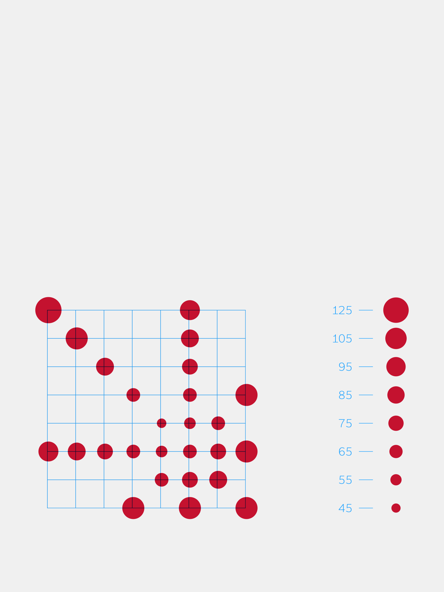
Air Greenland’s logo is a stylized ice crystal composed of dots in different sizes. The emblem symbolizes the airline's ability to operate in Arctic conditions, and its commitment to connecting communities across Greenland.
Air Greenland’s logo is a stylized ice crystal composed of dots in different sizes. The emblem symbolizes the airline's ability to operate in Arctic conditions, and its commitment to connecting communities across Greenland.

Air Greenland’s logo is a stylized ice crystal composed of dots in different sizes. The emblem symbolizes the airline's ability to operate in Arctic conditions, and its commitment to connecting communities across Greenland.

Air Greenland’s logo is a stylized ice crystal composed of dots in different sizes. The emblem symbolizes the airline's ability to operate in Arctic conditions, and its commitment to connecting communities across Greenland.
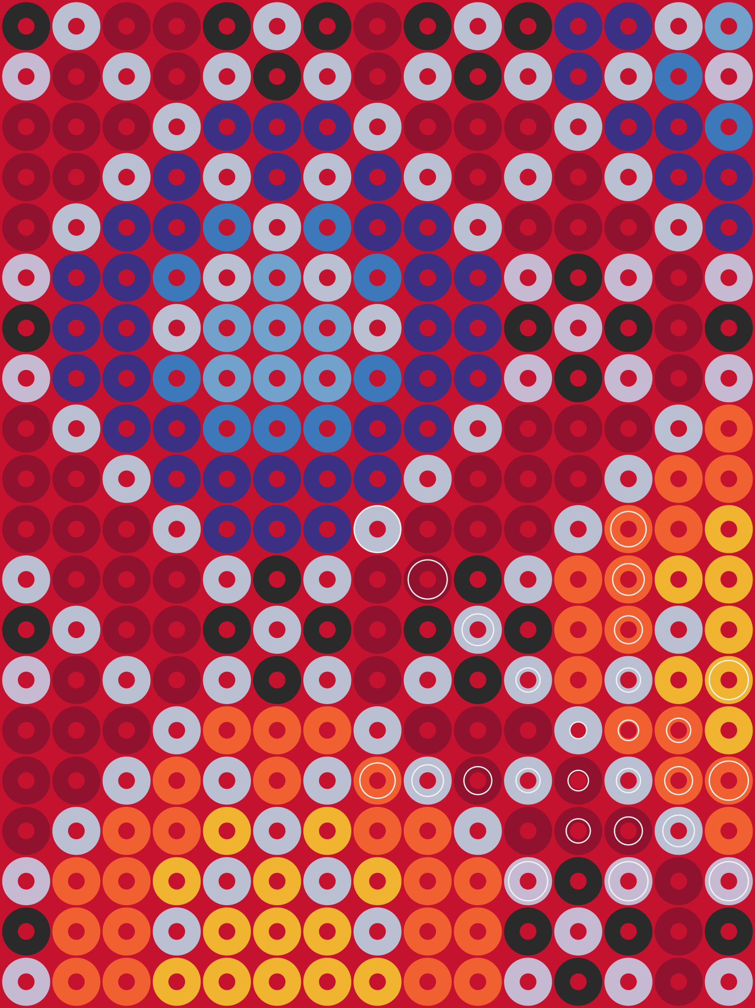
Air Greenland’s logo is a stylized ice crystal composed of dots in different sizes. The emblem symbolizes the airline's ability to operate in Arctic conditions, and its commitment to connecting communities across Greenland.

Air Greenland’s logo is a stylized ice crystal composed of dots in different sizes. The emblem symbolizes the airline's ability to operate in Arctic conditions, and its commitment to connecting communities across Greenland.

Air Greenland’s logo is a stylized ice crystal composed of dots in different sizes. The emblem symbolizes the airline's ability to operate in Arctic conditions, and its commitment to connecting communities across Greenland.

Air Greenland’s logo is a stylized ice crystal composed of dots in different sizes. The emblem symbolizes the airline's ability to operate in Arctic conditions, and its commitment to connecting communities across Greenland.
Air Greenland’s logo is a stylized ice crystal composed of dots in different sizes. The emblem symbolizes the airline's ability to operate in Arctic conditions, and its commitment to connecting communities across Greenland.

Air Greenland’s logo is a stylized ice crystal composed of dots in different sizes. The emblem symbolizes the airline's ability to operate in Arctic conditions, and its commitment to connecting communities across Greenland.
Air Greenland’s logo is a stylized ice crystal composed of dots in different sizes. The emblem symbolizes the airline's ability to operate in Arctic conditions, and its commitment to connecting communities across Greenland.


More than twenty years after we designed Air Greenland’s logo, the airline has expanded its activities to include adventure tourism, hospitality, and excursions — and they wanted to show the world that this is all part of the same family. This process resulted in five new logos, each an evolution of Air Greenland’s original ice crystal, along with six new core narratives.
More than twenty years after we designed Air Greenland’s logo, the airline has expanded its activities to include adventure tourism, hospitality, and excursions — and they wanted to show the world that this is all part of the same family. This process resulted in five new logos, each an evolution of Air Greenland’s original ice crystal, along with six new core narratives.

More than twenty years after we designed Air Greenland’s logo, the airline has expanded its activities to include adventure tourism, hospitality, and excursions — and they wanted to show the world that this is all part of the same family. This process resulted in five new logos, each an evolution of Air Greenland’s original ice crystal, along with six new core narratives.

More than twenty years after we designed Air Greenland’s logo, the airline has expanded its activities to include adventure tourism, hospitality, and excursions — and they wanted to show the world that this is all part of the same family. This process resulted in five new logos, each an evolution of Air Greenland’s original ice crystal, along with six new core narratives.
More than twenty years after we designed Air Greenland’s logo, the airline has expanded its activities to include adventure tourism, hospitality, and excursions — and they wanted to show the world that this is all part of the same family. This process resulted in five new logos, each an evolution of Air Greenland’s original ice crystal, along with six new core narratives.

More than twenty years after we designed Air Greenland’s logo, the airline has expanded its activities to include adventure tourism, hospitality, and excursions — and they wanted to show the world that this is all part of the same family. This process resulted in five new logos, each an evolution of Air Greenland’s original ice crystal, along with six new core narratives.
More than twenty years after we designed Air Greenland’s logo, the airline has expanded its activities to include adventure tourism, hospitality, and excursions — and they wanted to show the world that this is all part of the same family. This process resulted in five new logos, each an evolution of Air Greenland’s original ice crystal, along with six new core narratives.

More than twenty years after we designed Air Greenland’s logo, the airline has expanded its activities to include adventure tourism, hospitality, and excursions — and they wanted to show the world that this is all part of the same family. This process resulted in five new logos, each an evolution of Air Greenland’s original ice crystal, along with six new core narratives.
More than twenty years after we designed Air Greenland’s logo, the airline has expanded its activities to include adventure tourism, hospitality, and excursions — and they wanted to show the world that this is all part of the same family. This process resulted in five new logos, each an evolution of Air Greenland’s original ice crystal, along with six new core narratives.

More than twenty years after we designed Air Greenland’s logo, the airline has expanded its activities to include adventure tourism, hospitality, and excursions — and they wanted to show the world that this is all part of the same family. This process resulted in five new logos, each an evolution of Air Greenland’s original ice crystal, along with six new core narratives.
More than twenty years after we designed Air Greenland’s logo, the airline has expanded its activities to include adventure tourism, hospitality, and excursions — and they wanted to show the world that this is all part of the same family. This process resulted in five new logos, each an evolution of Air Greenland’s original ice crystal, along with six new core narratives.

To make sure all companies in Air Greenland Group speak with the same voice, we designed a custom typeface.
To make sure all companies in Air Greenland Group speak with the same voice, we designed a custom typeface.

To make sure all companies in Air Greenland Group speak with the same voice, we designed a custom typeface.

To make sure all companies in Air Greenland Group speak with the same voice, we designed a custom typeface.

To make sure all companies in Air Greenland Group speak with the same voice, we designed a custom typeface.

To make sure all companies in Air Greenland Group speak with the same voice, we designed a custom typeface.

To make sure all companies in Air Greenland Group speak with the same voice, we designed a custom typeface.

To make sure all companies in Air Greenland Group speak with the same voice, we designed a custom typeface.
To make sure all companies in Air Greenland Group speak with the same voice, we designed a custom typeface.

To make sure all companies in Air Greenland Group speak with the same voice, we designed a custom typeface.
To make sure all companies in Air Greenland Group speak with the same voice, we designed a custom typeface.

One challenge was the Greenlandic language itself, which has relatively few vowels. In place names like Ilulissat, for example, a capital I and a lowercase l look identical — not great for signs or readability. To fix this, we added serifs to the uppercase I so it stands out at a glance.
One challenge was the Greenlandic language itself, which has relatively few vowels. In place names like Ilulissat, for example, a capital I and a lowercase l look identical — not great for signs or readability. To fix this, we added serifs to the uppercase I so it stands out at a glance.

One challenge was the Greenlandic language itself, which has relatively few vowels. In place names like Ilulissat, for example, a capital I and a lowercase l look identical — not great for signs or readability. To fix this, we added serifs to the uppercase I so it stands out at a glance.

One challenge was the Greenlandic language itself, which has relatively few vowels. In place names like Ilulissat, for example, a capital I and a lowercase l look identical — not great for signs or readability. To fix this, we added serifs to the uppercase I so it stands out at a glance.
One challenge was the Greenlandic language itself, which has relatively few vowels. In place names like Ilulissat, for example, a capital I and a lowercase l look identical — not great for signs or readability. To fix this, we added serifs to the uppercase I so it stands out at a glance.

One challenge was the Greenlandic language itself, which has relatively few vowels. In place names like Ilulissat, for example, a capital I and a lowercase l look identical — not great for signs or readability. To fix this, we added serifs to the uppercase I so it stands out at a glance.
One challenge was the Greenlandic language itself, which has relatively few vowels. In place names like Ilulissat, for example, a capital I and a lowercase l look identical — not great for signs or readability. To fix this, we added serifs to the uppercase I so it stands out at a glance.

One challenge was the Greenlandic language itself, which has relatively few vowels. In place names like Ilulissat, for example, a capital I and a lowercase l look identical — not great for signs or readability. To fix this, we added serifs to the uppercase I so it stands out at a glance.
One challenge was the Greenlandic language itself, which has relatively few vowels. In place names like Ilulissat, for example, a capital I and a lowercase l look identical — not great for signs or readability. To fix this, we added serifs to the uppercase I so it stands out at a glance.

One challenge was the Greenlandic language itself, which has relatively few vowels. In place names like Ilulissat, for example, a capital I and a lowercase l look identical — not great for signs or readability. To fix this, we added serifs to the uppercase I so it stands out at a glance.
One challenge was the Greenlandic language itself, which has relatively few vowels. In place names like Ilulissat, for example, a capital I and a lowercase l look identical — not great for signs or readability. To fix this, we added serifs to the uppercase I so it stands out at a glance.


