Radio4 launched on November 1, 2019, taking over the FM4 frequency previously held by Radio24syv. But the common perception was that the station never really got off the ground. After a failed rebranding, with half the time and money gone, Nikolai Thyssen became its director and editor-in-chief in January 2024. Like a mad captain on a suicide mission, Thyssen came onboard with a do-or-die cheer: The radio station’s broadcasting license expires on December 31, 2027, so we may as well give it our all while we can. This mentality, the idea of the countdown, inspired the four lines in the new logo.


The four lines in the new logo also shaped the concept for the station’s podcast icons. With so many podcast feeds filled with busy visuals, RADIO IIII's icons stand out by stripping things back. They also work as an extension of the station’s ethos: confident, direct, and unmistakable.
The four lines in the new logo also shaped the concept for the station’s podcast icons. With so many podcast feeds filled with busy visuals, RADIO IIII's icons stand out by stripping things back. They also work as an extension of the station’s ethos: confident, direct, and unmistakable.
The four lines in the new logo also shaped the concept for the station’s podcast icons. With so many podcast feeds filled with busy visuals, RADIO IIII's icons stand out by stripping things back. They also work as an extension of the station’s ethos: confident, direct, and unmistakable.
The four lines in the new logo also shaped the concept for the station’s podcast icons. With so many podcast feeds filled with busy visuals, RADIO IIII's icons stand out by stripping things back. They also work as an extension of the station’s ethos: confident, direct, and unmistakable.
The four lines in the new logo also shaped the concept for the station’s podcast icons. With so many podcast feeds filled with busy visuals, RADIO IIII's icons stand out by stripping things back. They also work as an extension of the station’s ethos: confident, direct, and unmistakable.
The four lines in the new logo also shaped the concept for the station’s podcast icons. With so many podcast feeds filled with busy visuals, RADIO IIII's icons stand out by stripping things back. They also work as an extension of the station’s ethos: confident, direct, and unmistakable.
The four lines in the new logo also shaped the concept for the station’s podcast icons. With so many podcast feeds filled with busy visuals, RADIO IIII's icons stand out by stripping things back. They also work as an extension of the station’s ethos: confident, direct, and unmistakable.
The four lines in the new logo also shaped the concept for the station’s podcast icons. With so many podcast feeds filled with busy visuals, RADIO IIII's icons stand out by stripping things back. They also work as an extension of the station’s ethos: confident, direct, and unmistakable.
The four lines in the new logo also shaped the concept for the station’s podcast icons. With so many podcast feeds filled with busy visuals, RADIO IIII's icons stand out by stripping things back. They also work as an extension of the station’s ethos: confident, direct, and unmistakable.
The four lines in the new logo also shaped the concept for the station’s podcast icons. With so many podcast feeds filled with busy visuals, RADIO IIII's icons stand out by stripping things back. They also work as an extension of the station’s ethos: confident, direct, and unmistakable.
The four lines in the new logo also shaped the concept for the station’s podcast icons. With so many podcast feeds filled with busy visuals, RADIO IIII's icons stand out by stripping things back. They also work as an extension of the station’s ethos: confident, direct, and unmistakable.

For RADIO IIII, we used AI to create images that feel a little strange and unexpected. These are not just pictures — they’re conversation starters, meant to make people stop, look, and think.
For RADIO IIII, we used AI to create images that feel a little strange and unexpected. These are not just pictures — they’re conversation starters, meant to make people stop, look, and think.
For RADIO IIII, we used AI to create images that feel a little strange and unexpected. These are not just pictures — they’re conversation starters, meant to make people stop, look, and think.
For RADIO IIII, we used AI to create images that feel a little strange and unexpected. These are not just pictures — they’re conversation starters, meant to make people stop, look, and think.

But more than just a stylistic choice, we wanted the images to reflect RADIO IIII’s unconventional approach and the unpredictability that is so central to the station.
For RADIO IIII, we used AI to create images that feel a little strange and unexpected. These are not just pictures — they’re conversation starters, meant to make people stop, look, and think.
For RADIO IIII, we used AI to create images that feel a little strange and unexpected. These are not just pictures — they’re conversation starters, meant to make people stop, look, and think.
For RADIO IIII, we used AI to create images that feel a little strange and unexpected. These are not just pictures — they’re conversation starters, meant to make people stop, look, and think.
For RADIO IIII, we used AI to create images that feel a little strange and unexpected. These are not just pictures — they’re conversation starters, meant to make people stop, look, and think.
For RADIO IIII, we used AI to create images that feel a little strange and unexpected. These are not just pictures — they’re conversation starters, meant to make people stop, look, and think.


Color plays a key role for RADIO IIII. Using vibrant colors to set the station apart from the Danish Broadcast Corporation was an obvious choice. But the scheme goes deeper than that.
Color plays a key role for RADIO IIII. Using vibrant colors to set the station apart from the Danish Broadcast Corporation was an obvious choice. But the scheme goes deeper than that.
Color plays a key role for RADIO IIII. Using vibrant colors to set the station apart from the Danish Broadcast Corporation was an obvious choice. But the scheme goes deeper than that.
Color plays a key role for RADIO IIII. Using vibrant colors to set the station apart from the Danish Broadcast Corporation was an obvious choice. But the scheme goes deeper than that.
Color plays a key role for RADIO IIII. Using vibrant colors to set the station apart from the Danish Broadcast Corporation was an obvious choice. But the scheme goes deeper than that.
Color plays a key role for RADIO IIII. Using vibrant colors to set the station apart from the Danish Broadcast Corporation was an obvious choice. But the scheme goes deeper than that.
Color plays a key role for RADIO IIII. Using vibrant colors to set the station apart from the Danish Broadcast Corporation was an obvious choice. But the scheme goes deeper than that.
Color plays a key role for RADIO IIII. Using vibrant colors to set the station apart from the Danish Broadcast Corporation was an obvious choice. But the scheme goes deeper than that.
Color plays a key role for RADIO IIII. Using vibrant colors to set the station apart from the Danish Broadcast Corporation was an obvious choice. But the scheme goes deeper than that.
Color plays a key role for RADIO IIII. Using vibrant colors to set the station apart from the Danish Broadcast Corporation was an obvious choice. But the scheme goes deeper than that.
Color plays a key role for RADIO IIII. Using vibrant colors to set the station apart from the Danish Broadcast Corporation was an obvious choice. But the scheme goes deeper than that.

The wide and bold color palette reflects the station’s commitment to diverse perspectives. Just as its programming welcomes open debate and opposing viewpoints, its visual identity embraces variety, energy, and contrast.
The wide and bold color palette reflects the station’s commitment to diverse perspectives. Just as its programming welcomes open debate and opposing viewpoints, its visual identity embraces variety, energy, and contrast.
The wide and bold color palette reflects the station’s commitment to diverse perspectives. Just as its programming welcomes open debate and opposing viewpoints, its visual identity embraces variety, energy, and contrast.
The wide and bold color palette reflects the station’s commitment to diverse perspectives. Just as its programming welcomes open debate and opposing viewpoints, its visual identity embraces variety, energy, and contrast.
The wide and bold color palette reflects the station’s commitment to diverse perspectives. Just as its programming welcomes open debate and opposing viewpoints, its visual identity embraces variety, energy, and contrast.
The wide and bold color palette reflects the station’s commitment to diverse perspectives. Just as its programming welcomes open debate and opposing viewpoints, its visual identity embraces variety, energy, and contrast.
The wide and bold color palette reflects the station’s commitment to diverse perspectives. Just as its programming welcomes open debate and opposing viewpoints, its visual identity embraces variety, energy, and contrast.
The wide and bold color palette reflects the station’s commitment to diverse perspectives. Just as its programming welcomes open debate and opposing viewpoints, its visual identity embraces variety, energy, and contrast.
The wide and bold color palette reflects the station’s commitment to diverse perspectives. Just as its programming welcomes open debate and opposing viewpoints, its visual identity embraces variety, energy, and contrast.
The wide and bold color palette reflects the station’s commitment to diverse perspectives. Just as its programming welcomes open debate and opposing viewpoints, its visual identity embraces variety, energy, and contrast.
The wide and bold color palette reflects the station’s commitment to diverse perspectives. Just as its programming welcomes open debate and opposing viewpoints, its visual identity embraces variety, energy, and contrast.
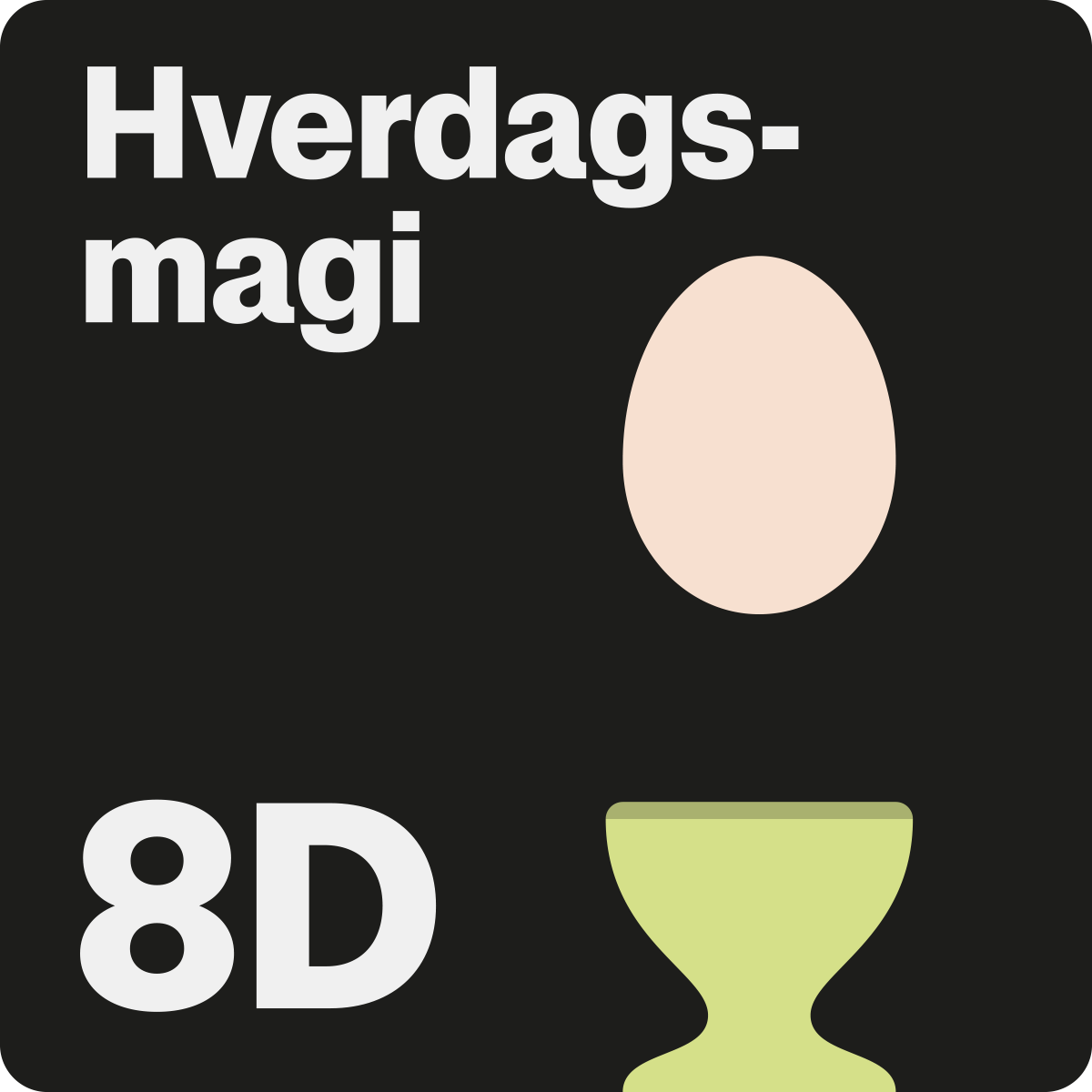
In a world where we navigate by tapping and swiping, icons are the new alphabet. To give RADIO IIII a distinct visual language, we designed a set of icons that keep the station’s identity consistent across all interactions. From the website to the app, each icon accentuates RADIO IIII’s tone of voice, making the station’s presence felt even in the smallest details. Equally important, the bespoke icons reinforce the idea that nothing about the reborn station is standard or off-the-shelf.
In a world where we navigate by tapping and swiping, icons are the new alphabet. To give RADIO IIII a distinct visual language, we designed a set of icons that keep the station’s identity consistent across all interactions. From the website to the app, each icon accentuates RADIO IIII’s tone of voice, making the station’s presence felt even in the smallest details. Equally important, the bespoke icons reinforce the idea that nothing about the reborn station is standard or off-the-shelf.
In a world where we navigate by tapping and swiping, icons are the new alphabet. To give RADIO IIII a distinct visual language, we designed a set of icons that keep the station’s identity consistent across all interactions. From the website to the app, each icon accentuates RADIO IIII’s tone of voice, making the station’s presence felt even in the smallest details. Equally important, the bespoke icons reinforce the idea that nothing about the reborn station is standard or off-the-shelf.
In a world where we navigate by tapping and swiping, icons are the new alphabet. To give RADIO IIII a distinct visual language, we designed a set of icons that keep the station’s identity consistent across all interactions. From the website to the app, each icon accentuates RADIO IIII’s tone of voice, making the station’s presence felt even in the smallest details. Equally important, the bespoke icons reinforce the idea that nothing about the reborn station is standard or off-the-shelf.
In a world where we navigate by tapping and swiping, icons are the new alphabet. To give RADIO IIII a distinct visual language, we designed a set of icons that keep the station’s identity consistent across all interactions. From the website to the app, each icon accentuates RADIO IIII’s tone of voice, making the station’s presence felt even in the smallest details. Equally important, the bespoke icons reinforce the idea that nothing about the reborn station is standard or off-the-shelf.
In a world where we navigate by tapping and swiping, icons are the new alphabet. To give RADIO IIII a distinct visual language, we designed a set of icons that keep the station’s identity consistent across all interactions. From the website to the app, each icon accentuates RADIO IIII’s tone of voice, making the station’s presence felt even in the smallest details. Equally important, the bespoke icons reinforce the idea that nothing about the reborn station is standard or off-the-shelf.
In a world where we navigate by tapping and swiping, icons are the new alphabet. To give RADIO IIII a distinct visual language, we designed a set of icons that keep the station’s identity consistent across all interactions. From the website to the app, each icon accentuates RADIO IIII’s tone of voice, making the station’s presence felt even in the smallest details. Equally important, the bespoke icons reinforce the idea that nothing about the reborn station is standard or off-the-shelf.
In a world where we navigate by tapping and swiping, icons are the new alphabet. To give RADIO IIII a distinct visual language, we designed a set of icons that keep the station’s identity consistent across all interactions. From the website to the app, each icon accentuates RADIO IIII’s tone of voice, making the station’s presence felt even in the smallest details. Equally important, the bespoke icons reinforce the idea that nothing about the reborn station is standard or off-the-shelf.
In a world where we navigate by tapping and swiping, icons are the new alphabet. To give RADIO IIII a distinct visual language, we designed a set of icons that keep the station’s identity consistent across all interactions. From the website to the app, each icon accentuates RADIO IIII’s tone of voice, making the station’s presence felt even in the smallest details. Equally important, the bespoke icons reinforce the idea that nothing about the reborn station is standard or off-the-shelf.
In a world where we navigate by tapping and swiping, icons are the new alphabet. To give RADIO IIII a distinct visual language, we designed a set of icons that keep the station’s identity consistent across all interactions. From the website to the app, each icon accentuates RADIO IIII’s tone of voice, making the station’s presence felt even in the smallest details. Equally important, the bespoke icons reinforce the idea that nothing about the reborn station is standard or off-the-shelf.
In a world where we navigate by tapping and swiping, icons are the new alphabet. To give RADIO IIII a distinct visual language, we designed a set of icons that keep the station’s identity consistent across all interactions. From the website to the app, each icon accentuates RADIO IIII’s tone of voice, making the station’s presence felt even in the smallest details. Equally important, the bespoke icons reinforce the idea that nothing about the reborn station is standard or off-the-shelf.

Another way to stand out from the competition — and to show the station's love for the unpredictability and excitement of live broadcasts — was in how we photographed the hosts.
Another way to stand out from the competition — and to show the station's love for the unpredictability and excitement of live broadcasts — was in how we photographed the hosts.
Another way to stand out from the competition — and to show the station's love for the unpredictability and excitement of live broadcasts — was in how we photographed the hosts.
Another way to stand out from the competition — and to show the station's love for the unpredictability and excitement of live broadcasts — was in how we photographed the hosts.

Another way to stand out from the competition — and to show the station's love for the unpredictability and excitement of live broadcasts — was in how we photographed the hosts.
Another way to stand out from the competition — and to show the station's love for the unpredictability and excitement of live broadcasts — was in how we photographed the hosts.
Another way to stand out from the competition — and to show the station's love for the unpredictability and excitement of live broadcasts — was in how we photographed the hosts.
Another way to stand out from the competition — and to show the station's love for the unpredictability and excitement of live broadcasts — was in how we photographed the hosts.
Another way to stand out from the competition — and to show the station's love for the unpredictability and excitement of live broadcasts — was in how we photographed the hosts.
Another way to stand out from the competition — and to show the station's love for the unpredictability and excitement of live broadcasts — was in how we photographed the hosts.
Another way to stand out from the competition — and to show the station's love for the unpredictability and excitement of live broadcasts — was in how we photographed the hosts.

Instead of polished, static portraits, the images capture spontaneity, and personality, reflecting the station's lively and unscripted nature.
Instead of polished, static portraits, the images capture spontaneity, and personality, reflecting the station's lively and unscripted nature.
Instead of polished, static portraits, the images capture spontaneity, and personality, reflecting the station's lively and unscripted nature.
Instead of polished, static portraits, the images capture spontaneity, and personality, reflecting the station's lively and unscripted nature.

Instead of polished, static portraits, the images capture spontaneity, and personality, reflecting the station's lively and unscripted nature.
Instead of polished, static portraits, the images capture spontaneity, and personality, reflecting the station's lively and unscripted nature.
Instead of polished, static portraits, the images capture spontaneity, and personality, reflecting the station's lively and unscripted nature.
Instead of polished, static portraits, the images capture spontaneity, and personality, reflecting the station's lively and unscripted nature.
Instead of polished, static portraits, the images capture spontaneity, and personality, reflecting the station's lively and unscripted nature.
Instead of polished, static portraits, the images capture spontaneity, and personality, reflecting the station's lively and unscripted nature.
Instead of polished, static portraits, the images capture spontaneity, and personality, reflecting the station's lively and unscripted nature.