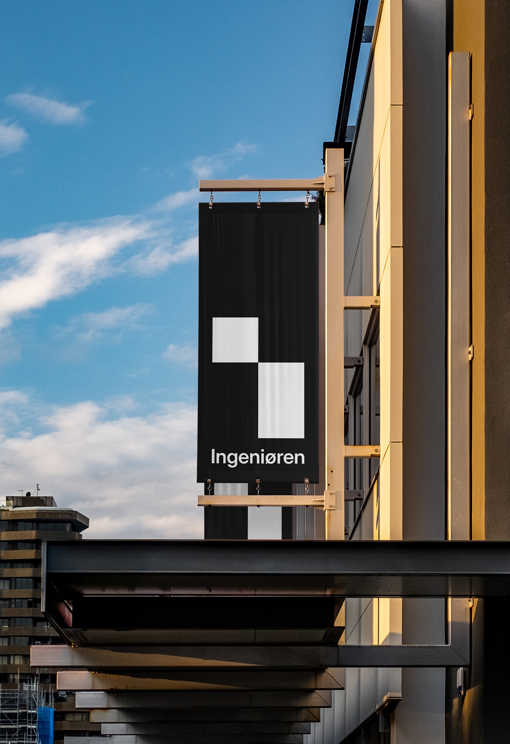
Ingeniøren is Denmark’s leading technology media outlet, covering everything from biotech to construction, AI to aerospace. It publishes a newspaper, runs podcasts, blogs, and events, and oversees a growing number of specialized sub-brands. To support that expansion – and to hold it all together – Ingeniøren needed a flexible visual system: one identity that could work across platforms, channels, and contexts, without losing its center.

At the heart of the identity is a single symbol: an “I” for Ingeniøren, with the top nudged off its axis. That shift carries weight. Some see a pixel — a nod to the digital world Ingeniøren inhabits. Others read it as a gesture: something being opened, examined, made visible.
At the heart of the identity is a single symbol: an “I” for Ingeniøren, with the top nudged off its axis. That shift carries weight. Some see a pixel — a nod to the digital world Ingeniøren inhabits. Others read it as a gesture: something being opened, examined, made visible.


At the heart of the identity is a single symbol: an “I” for Ingeniøren, with the top nudged off its axis. That shift carries weight. Some see a pixel — a nod to the digital world Ingeniøren inhabits. Others read it as a gesture: something being opened, examined, made visible.
At the heart of the identity is a single symbol: an “I” for Ingeniøren, with the top nudged off its axis. That shift carries weight. Some see a pixel — a nod to the digital world Ingeniøren inhabits. Others read it as a gesture: something being opened, examined, made visible.
Or perhaps a sign that this is a system in motion, not a static organization. Whatever you see, it signals belonging. The dot may move, but it always stays part of the i.
At the heart of the identity is a single symbol: an “I” for Ingeniøren, with the top nudged off its axis. That shift carries weight. Some see a pixel — a nod to the digital world Ingeniøren inhabits. Others read it as a gesture: something being opened, examined, made visible.
At the heart of the identity is a single symbol: an “I” for Ingeniøren, with the top nudged off its axis. That shift carries weight. Some see a pixel — a nod to the digital world Ingeniøren inhabits. Others read it as a gesture: something being opened, examined, made visible.
At the heart of the identity is a single symbol: an “I” for Ingeniøren, with the top nudged off its axis. That shift carries weight. Some see a pixel — a nod to the digital world Ingeniøren inhabits. Others read it as a gesture: something being opened, examined, made visible.
At the heart of the identity is a single symbol: an “I” for Ingeniøren, with the top nudged off its axis. That shift carries weight. Some see a pixel — a nod to the digital world Ingeniøren inhabits. Others read it as a gesture: something being opened, examined, made visible.
At the heart of the identity is a single symbol: an “I” for Ingeniøren, with the top nudged off its axis. That shift carries weight. Some see a pixel — a nod to the digital world Ingeniøren inhabits. Others read it as a gesture: something being opened, examined, made visible.


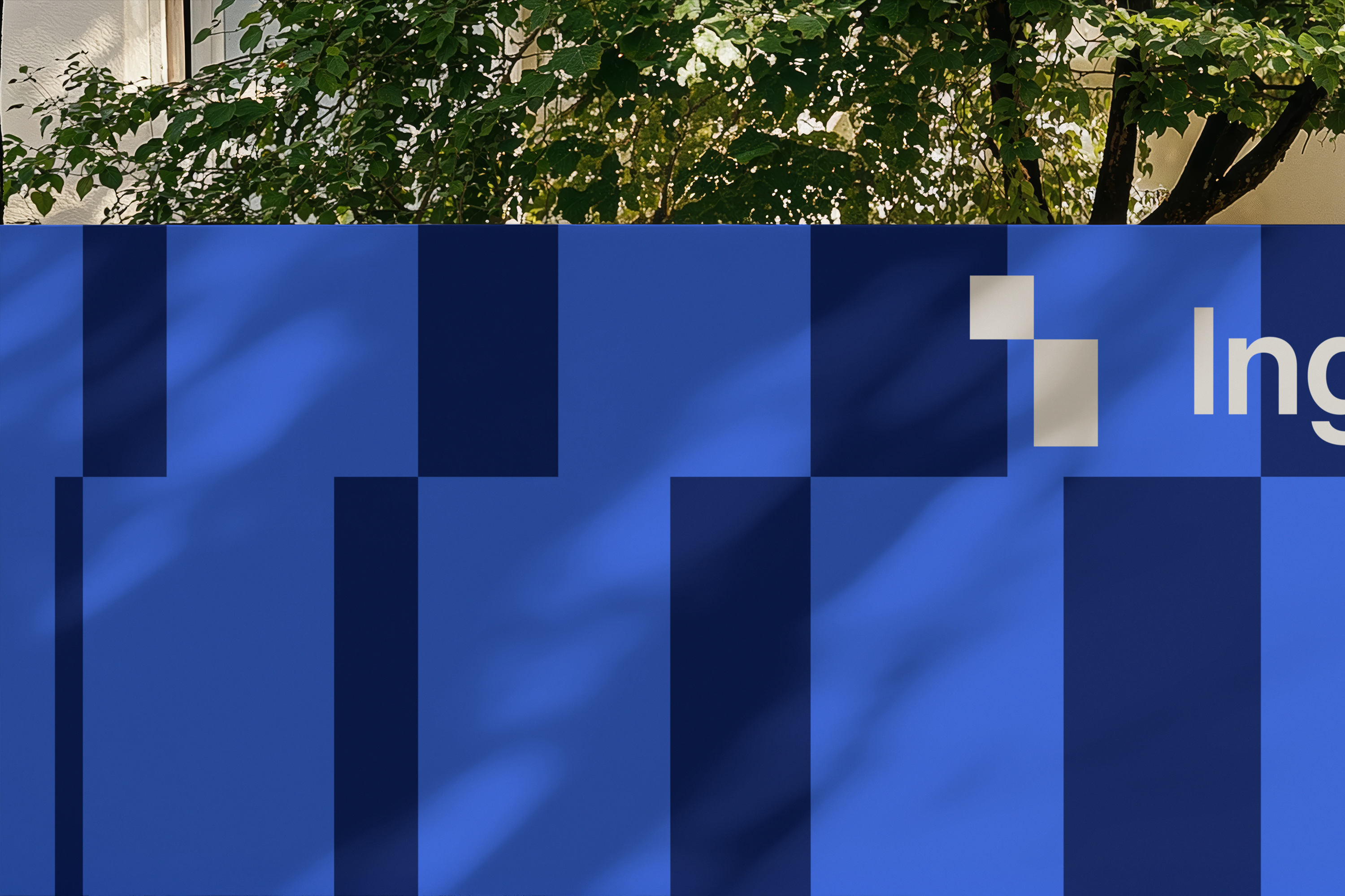
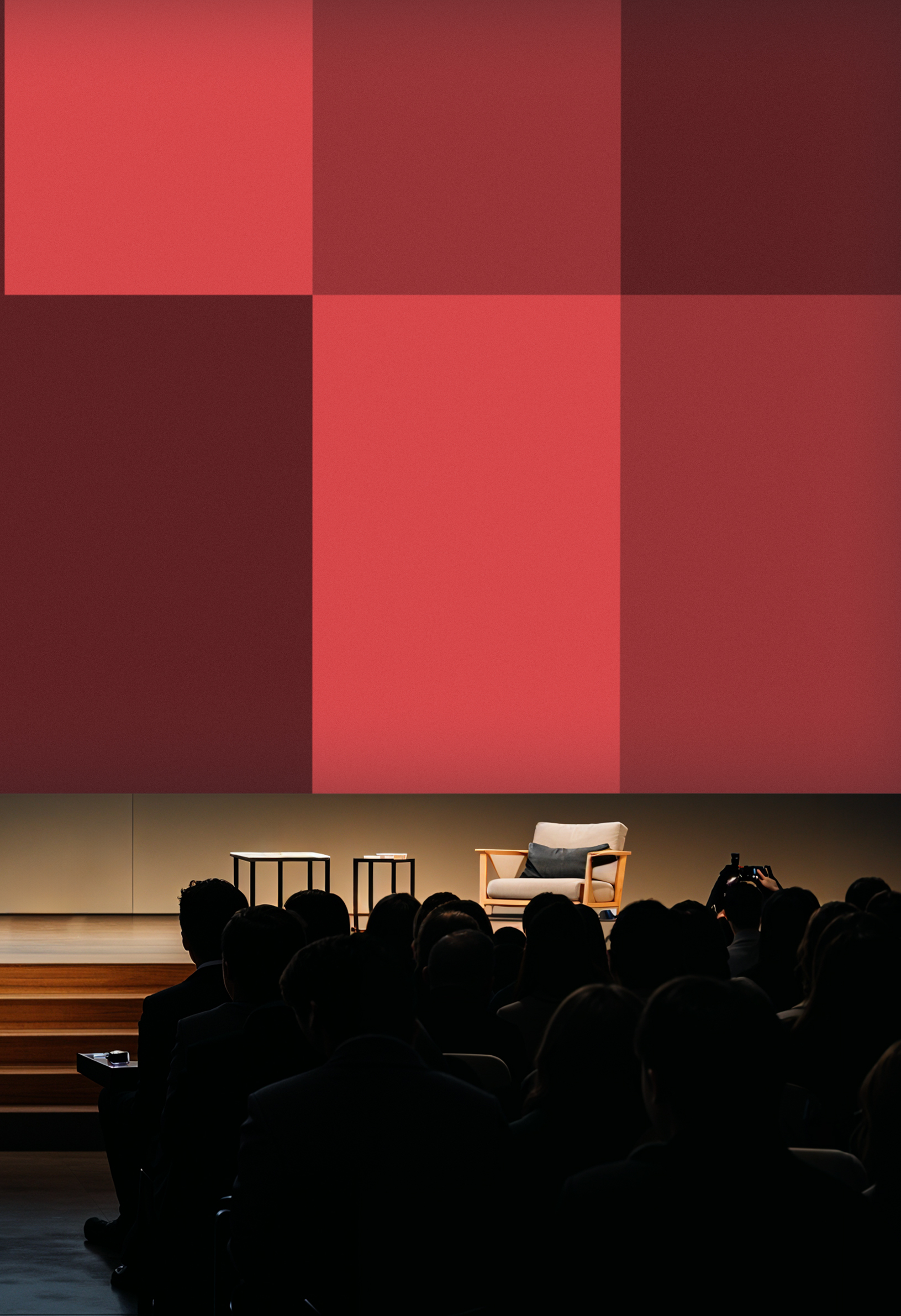
Ingeniøren doesn’t have a single color. It has many. The identity is designed to adapt — to context, to content, to medium. It can take on any tone and still hold its shape. And yet, at the core, there’s black. Chosen for its neutrality, its clarity, and its authority. Black gives the system something to return to. A shared note across a range of voices.
Ingeniøren doesn’t have a single color. It has many. The identity is designed to adapt — to context, to content, to medium. It can take on any tone and still hold its shape. And yet, at the core, there’s black. Chosen for its neutrality, its clarity, and its authority. Black gives the system something to return to. A shared note across a range of voices.
Ingeniøren doesn’t have a single color. It has many. The identity is designed to adapt — to context, to content, to medium. It can take on any tone and still hold its shape. And yet, at the core, there’s black. Chosen for its neutrality, its clarity, and its authority. Black gives the system something to return to. A shared note across a range of voices.
Ingeniøren doesn’t have a single color. It has many. The identity is designed to adapt — to context, to content, to medium. It can take on any tone and still hold its shape. And yet, at the core, there’s black. Chosen for its neutrality, its clarity, and its authority. Black gives the system something to return to. A shared note across a range of voices.
Ingeniøren doesn’t have a single color. It has many. The identity is designed to adapt — to context, to content, to medium. It can take on any tone and still hold its shape. And yet, at the core, there’s black. Chosen for its neutrality, its clarity, and its authority. Black gives the system something to return to. A shared note across a range of voices.
Ingeniøren doesn’t have a single color. It has many. The identity is designed to adapt — to context, to content, to medium. It can take on any tone and still hold its shape. And yet, at the core, there’s black. Chosen for its neutrality, its clarity, and its authority. Black gives the system something to return to. A shared note across a range of voices.
Ingeniøren doesn’t have a single color. It has many. The identity is designed to adapt — to context, to content, to medium. It can take on any tone and still hold its shape. And yet, at the core, there’s black. Chosen for its neutrality, its clarity, and its authority. Black gives the system something to return to. A shared note across a range of voices.
Ingeniøren doesn’t have a single color. It has many. The identity is designed to adapt — to context, to content, to medium. It can take on any tone and still hold its shape. And yet, at the core, there’s black. Chosen for its neutrality, its clarity, and its authority. Black gives the system something to return to. A shared note across a range of voices.
Ingeniøren doesn’t have a single color. It has many. The identity is designed to adapt — to context, to content, to medium. It can take on any tone and still hold its shape. And yet, at the core, there’s black. Chosen for its neutrality, its clarity, and its authority. Black gives the system something to return to. A shared note across a range of voices.
Ingeniøren doesn’t have a single color. It has many. The identity is designed to adapt — to context, to content, to medium. It can take on any tone and still hold its shape. And yet, at the core, there’s black. Chosen for its neutrality, its clarity, and its authority. Black gives the system something to return to. A shared note across a range of voices.
Ingeniøren doesn’t have a single color. It has many. The identity is designed to adapt — to context, to content, to medium. It can take on any tone and still hold its shape. And yet, at the core, there’s black. Chosen for its neutrality, its clarity, and its authority. Black gives the system something to return to. A shared note across a range of voices.